

When my business partner told me he was about to start creating limited edition camera lenses using parts from traditional lenses, I knew I would enjoy creating the logo and brand identity design.
Once the business had a name, Omnar, I cracked on with designing a brand identity to reflect the history behind the lens concept, the precision of the tooling involved in the manufacture of the lenses, and the high-end exclusivity of the products.


I came up with a custom typeface for the lettering based on the circle of the ‘o’. The logotype as a whole is a bit of a throwback to the weird fonts used on vintage lenses, in particular the strange M uses the same shapes as a lens diagram
Omnar will be engraving the logo onto the final product. I made sure that the line thickness was appropriate for the size of the engraving tool being used. Then I set it so that if the logo is 5mm high, the line is 0.5mm thick. I can’t wait to see it engraved on the actual products. With this sort of brand identity design where it will be used on products and in different scenarios, details like this are key to creating an consistent brand image.
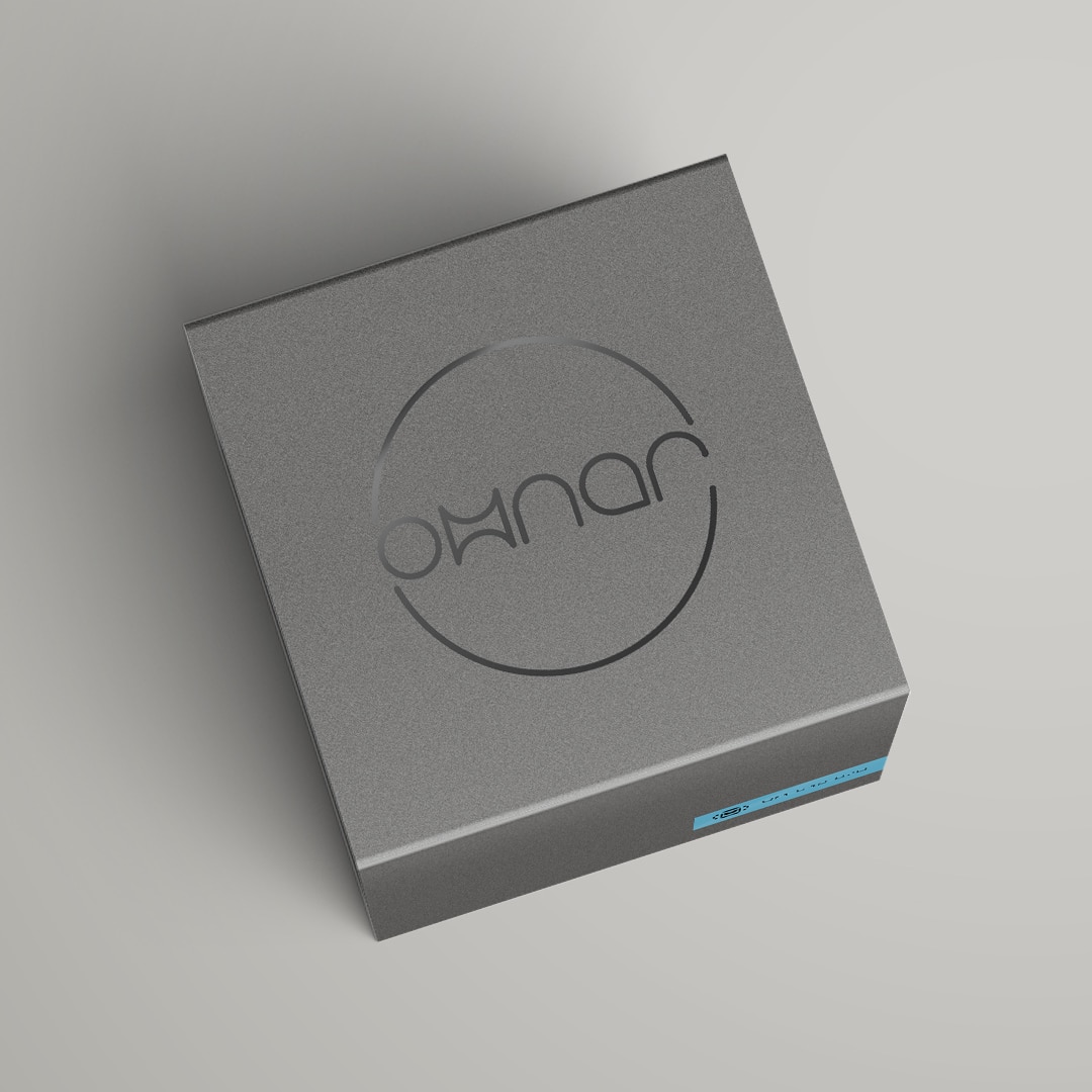
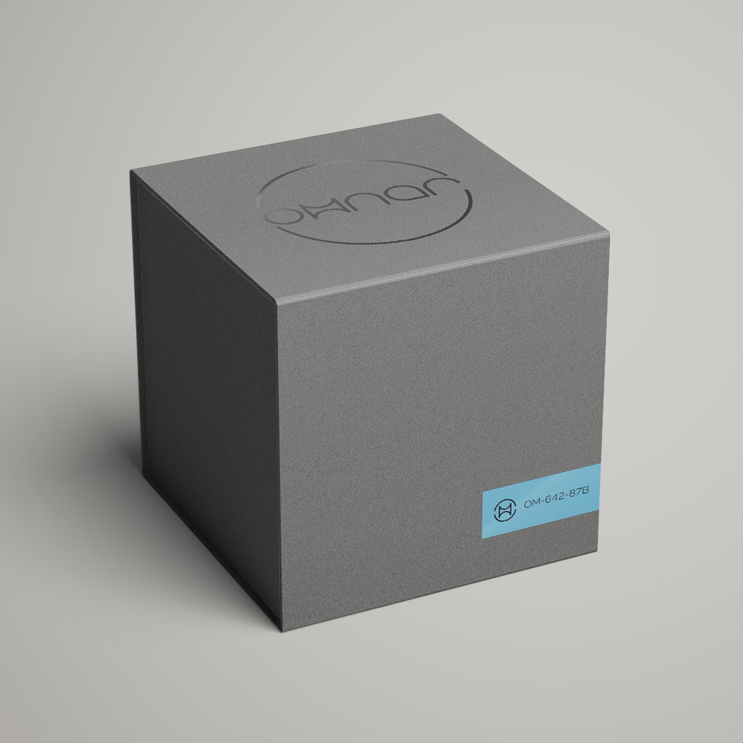
For the packaging, me and my designer at F8 carefully selected a paper colour and finish to give the box a high end luxurious feel. So that the logo stands out and contrasts to the rest of the box, it will be printed in a black metallic style finish. The overall design is very minimal as this is an exclusive, limited edition product.
